A Few Notes on Ordinary Least Squares
We want to model collectivism (GCI) based on ecological threats (i.e. epidemics) and national wealth (GDP). Let’s get the data:
ecodata <- read.csv("https://raw.githubusercontent.com/soheilshapouri/epidemics_collectivism/main/Data%20S2.csv")
If we have more predictors than observations, we will switch to regilarized regression. But that is not the case here so we move on to train-test split.
set.seed(123)
index <- sample(nrow(ecodata), round(nrow(ecodata)*0.8))
eco_train <- ecodata[index, ]
eco_test <- ecodata[-index, ]
Start with a simple linear regression
model1 <- lm(GCI ~ No_Epidemics, data = eco_train)
In parenthesis, you can get the same thing with glm(GCI ~ No_Epidemics, family = “gaussian”, data = eco_train).
Anyway, even for simple linear regression there is a better way to do it, using cross-validation to get more reliable assessment of model performance.
library(caret)
set.seed(123)
cv_model1 <- train(
  form = GCI ~ No_Epidemics,
  data = eco_train,
  method = "lm",
  trControl = trainControl(method = "cv", number = 10)
)
Now that we have the model, We can extract its information.
# regression coefficients
coef(cv_model1$finalModel)
#RMSE
sigma(cv_model1$finalModel)
#confidence interval
confint(cv_model1$finalModel)

# and the mode important thing, getting the model summary
summary(cv_model1$finalModel)
# where Residual standard error is RMSE
# and R-squared is the amount of variance in response explained by explanatory variable(s)
If the goal is inference, very low R-squared tells me this is not a good model. If the goal is prediction, considering the range of reponse “GCI”, which is -1.85 to +1.92 RMSE of 0.72 is pretty high. For both cases, I would add more predcitors to see whether I can explain more variability or lower RMSE.
cv_model2 <- train(
  form = GCI ~ No_Epidemics + GDP,
  data = eco_train,
  method = "lm",
  trControl = trainControl(method = "cv", number = 10)
)
summary(cv_model2$finalModel)
R-squared was increased while RMSE was decreased. We are in the right direction but we should always consider the possibility of interactions.
cv_model3 <- train(
  form = GCI ~ No_Epidemics + GDP + No_Epidemics:GDP,
  data = eco_train,
  method = "lm",
  trControl = trainControl(method = "cv", number = 10)
)
summary(cv_model3$finalModel)
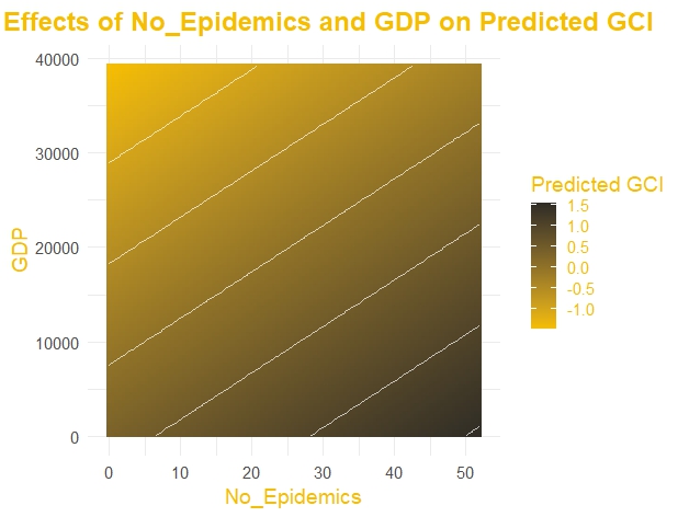
A small increase in R2 and a decrease in RMSE is noticed. But before moving further let’s create a visualization of model 2. A contour plot for two main effects and predicted GCI.
grid <- expand.grid(
  No_Epidemics = seq(min(eco_train$No_Epidemics), max(eco_train$No_Epidemics), length.out = 100),
  GDP = seq(min(eco_train$GDP), max(eco_train$GDP), length.out = 100)
)

grid$Predicted_GCI <- predict(cv_model2$finalModel, newdata = grid)

library(ggplot2)

ggplot(grid, aes(x = No_Epidemics, y = GDP, z = Predicted_GCI)) +
  geom_tile(aes(fill = Predicted_GCI)) +
  scale_fill_gradient(low = "#F6BE00", high = "#302D26", name = "Predicted GCI") + # Yellowish gradient
  geom_contour(color = "white", alpha = 0.7) + # Add white contour lines
  labs(
    title = "Main Effects of No_Epidemics and GDP on Predicted GCI",
    x = "No_Epidemics",
    y = "GDP"
  ) +
  theme_minimal(base_size = 14) + # Use a minimal theme
  theme(
    plot.title = element_text(face = "bold", size = 18, hjust = 0.5, color = "#F6BE00"),
    axis.title = element_text(color = "#F6BE00"),
    legend.title = element_text(color = "#F6BE00"),
    legend.text = element_text(color = "#F6BE00")
  )
Now we have three models and I want to compare them systematically, looking at their average performance across test sets of cross-validation.
summary(resamples(list(
  cv_model1,
  cv_model2,
  cv_model3
)))
obviously model 2 is the best in terms of R2 and RMSE. Now, we need to make sure that it is statistically valid by checking regression assumptions.
First, the relationship should be linear.
ggplot(data = eco_train, aes(No_Epidemics, GCI))+
  geom_point()+
  geom_smooth(se = FALSE)

ggplot(data = eco_train, aes(GDP, GCI))+
  geom_point()+
  geom_smooth(se = FALSE)
The code will add a smoothed line (LOESS for small datasets or GAM for larger datasets) to the plot. In both cases, a non-linear pattern is noticed. As the line is not straight, we can transform the data. log10() is the most common option. In this case, though, becuase of have 0s for number of epidemics that’s not possible. Some poeple add a small constant before log transformation to solve the problem of 0s but research suggests this might change the significance and estimate of ceofficients. So, I use inverse-rank normal transformation.
Note: The tranformation is decided based on the train set but then will be applied ot both train and test sets.
library(RNOmni)
eco_train[["No_Epidemics"]] <- RankNorm(eco_train[["No_Epidemics"]], ties.method = "first")
eco_train[["GDP"]] <- RankNorm(eco_train[["GDP"]], ties.method = "first")
eco_test[["No_Epidemics"]] <- RankNorm(eco_test[["No_Epidemics"]], ties.method = "first")
eco_test[["GDP"]] <- RankNorm(eco_test[["GDP"]], ties.method = "first")
I run the model (cv_model2) again, and still model 2 is the best but also the relationship looks more linear. second, homoscedasticity or constant variance among residuals which can be checked by fitted vs residual Plot.
# Extract fitted values and residuals from the model
fitted_values <- predict(cv_model2, newdata = eco_train)
residuals <- eco_train$GCI - fitted_values

# Create the plot using ggplot2
library(ggplot2)
ggplot(data = NULL, aes(x = fitted_values, y = residuals)) +
  geom_point(color = "blue", alpha = 0.6) +  # Scatter points
  geom_hline(yintercept = 0, color = "red", linetype = "dashed") +  # Reference line at 0
  labs(
    title = "Fitted vs Residuals Plot",
    x = "Fitted Values",
    y = "Residuals"
  ) +
  theme_minimal()
No prblem is detected here, but if there was any, I would add predcitors or transfrom the data.
Third, is independence of observations. This is much more complicated and will write about this later in length, but for now, check row IDs vs. residuals for waves or periodic patterns.
eco_train$Row_ID <- 1:nrow(eco_train)

ggplot(data = eco_train, aes(x = Row_ID, y = residuals)) +
  geom_point(color = "black", alpha = 0.6) +  # Scatter points for residuals
  geom_hline(yintercept = 0, color = "red", linetype = "dashed") +  # Zero line
  labs(
    title = "Model 2",
    subtitle = "Correlated residuals.",
    x = "Row ID",
    y = "Residuals"
  ) +
  theme_minimal(base_size = 14) +
  theme(
    plot.title = element_text(face = "bold", size = 16, hjust = 0.5),
    plot.subtitle = element_text(size = 12, hjust = 0.5)
  )
In this case, there is not any probelm but countires, experimental units in this study are not actually independent. This autocorreltion, make CI narrower than they should be. Anyway, possible solutions for non-independence or autocorrelations are mixed-effect modeling or at least inclusion of sources (e.g., neighborhood, states, regions, etc.)
Fourth, Multicolinearity. Correltion between predictors is a problem and can be assessed by vif(). Possible solutions include removing offending varibales, using regularized regression instead of OLS, and using principal component regression or partial least squares as part of OLS.
Once, you have a statistically valid model, check its robustness with Cook’s distance and find variable importance by vip package. Finally and more importantly, check it on the test set to see its generizability.
some basic concepts
When we use OLS and want to solve y = a + bx, we can calculate a and b manually:
y = a + bx
b = cov(x,y) / var(x)
a = mean(y) - b * mean(x)
notes from art of stat textbook
# read the file

url <- "https://img1.wsimg.com/blobby/go/bbca5dba-4947-4587-b40a-db346c01b1b3/downloads/high_school_female_athletes.csv?ver=1709965709935"
athletes <- read.csv(url)
# A rough guideline is that the sample size n should be
# at least 10 times the number of explanatory variables


# name of te varibales
str(athletes)

#pre-processing
# dataset$variable_year_from_0 <- dataset$variable_year - 1994


# regress body weight on height, body fat, and age
reg_athletes <- lm(WT..lbs. ~ HT..IN. + BF. + AGE, data = athletes)


#check assumptions

# add residuals to dataset
athletes$residulas <- rstandard(athletes_reg)

# linear relationship
pairs(athletes[c("WT..lbs.", "HT..IN.", "BF.", "AGE")])
# or
ggplot(data = athletes, aes(BF., WT..lbs.))+
  geom_point()+
  geom_smooth(method = 'lm', se = F)
# non-linear? use glm() with poisson


# normality of residuals; two ways to test this
# 1 distribution of residuals
hist(rstandard(athletes_reg))
# this shows whether conditional distibution of y at each fixed value of x is normal or not
# 2 linear relationship between residuals and each explanatory variable
# population values of y at each predictor should be normally distributed with the same standard distribution
ggplot(data = athletes, aes(x = HT..IN., y = residulas))+
  geom_point()
#These two plot show the regression equation captures the relationship well

# residuals are not normal? use the log(y) instead of y


# regression outputs
anova(athletes_reg)
summary(athletes_reg)
fitted(athletes_reg)
residuals(athletes_reg)
predict(athletes_reg) # this will return things same as fitted unless you give it new data
athletes$yhat <- predict(athletes_reg)
cor(athletes$WT..lbs., athletes$yhat) # multiple correlation coefficinet R
cor(athletes$WT..lbs., athletes$yhat)^2 # r2
confint(athletes_reg)


#interpretation of output

# when the slope, beta, is 0, x and y are statistically independent

# t = b - 0 / se

# r2: proprtional reduction in error if we use y-hat instead of y-bar
# r2: the amount of variation in y explanied by explanatory variables

# confidence interval at specific X
predict(athletes_reg, newdata = data.frame(BF. = 15, HT..IN. = 65, AGE = 22), interval = "confidence")
# The average of all poeple with those specific BF, HT, and AGE will be between 80 and 109
# This returns a confidence interval for the mean response (i.e., the predicted average outcome)
#at those specific predictor values.

# prediction interval
predict(athletes_reg, newdata = data.frame(BF. = 15, HT..IN. = 65, AGE = 22), interval = "prediction")
# (73, 117): This is the range where an individual response (i.e., predicted weight) is expected to fall
# for a person with BF = 15, HT = 65, and AGE = 22, with 95% confidence.


# more explanation on regression

# b is basically standardized r
# b = r * (Sx / Sy)


# when you have a categorical predictor, reg coefficient is
# basically the (average) difference between two levels


# F test is significant while none of the two predictors are significant
# which happens as a result of multicollinearity